My screen time is a hard pill to swallow. Between working online all day, reading my Kindle at night, and going through the motions of being a Zillennial just trying to coordinate movie night with my friends, the hours I spend staring at a screen are enough to make any modern-day optometrist a little dizzy.
And that’s not even accounting for the social media scrolling that strikes whenever I’m waiting for software to load. It’s unconscious at this point — waiting for a single email to come through suddenly turns into six Instagram Reels before I regain control of my consciousness again.
Muscle memory and dopamine spikes are the culprits, sure, but it’s not like I put too many barriers between me and the doomscroll. It’s far too easy to access my social media apps, and I can’t just delete them — I’m a social media manager, after all. So rather than imposing time limits I’d just ignore, I tweaked two tiny settings that tricked me out of my scrolling tendencies: app appearance and labels.
- Brand
-
Apple
- SoC
-
A19 Pro
- Display
-
6.3-inch 1206 x 2622 pixel resolution Super Retina XDR OLED, 120Hz, HDR10, Dolby Vision, 1000 nits / 1600 nits peak brightness
- RAM
-
N/A
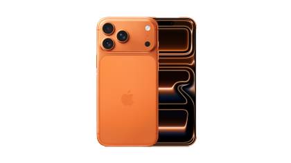
The iPhone 17 Pro is Apple’s next-generation flagship smartphone, with a new aluminum unibody design, a full-width camera plateau, the A19 Pro chipset, and a 6.3-inch display.
Radical app appearance changes
Because the grayscale trick isn’t realistic
Anyone I’ve ever known who’s put their phone in grayscale mode has lasted about a week before flooding their screen with color again. Sure, it makes addictive apps less appealing, but it also makes it borderline impossible to take (and look at) pictures, watch videos, or do any kind of online shopping. It’s true that grayscale can cut screen time, but it does so by making your device miserable to use — and there’s definitely a better way to do that without the misery factor.
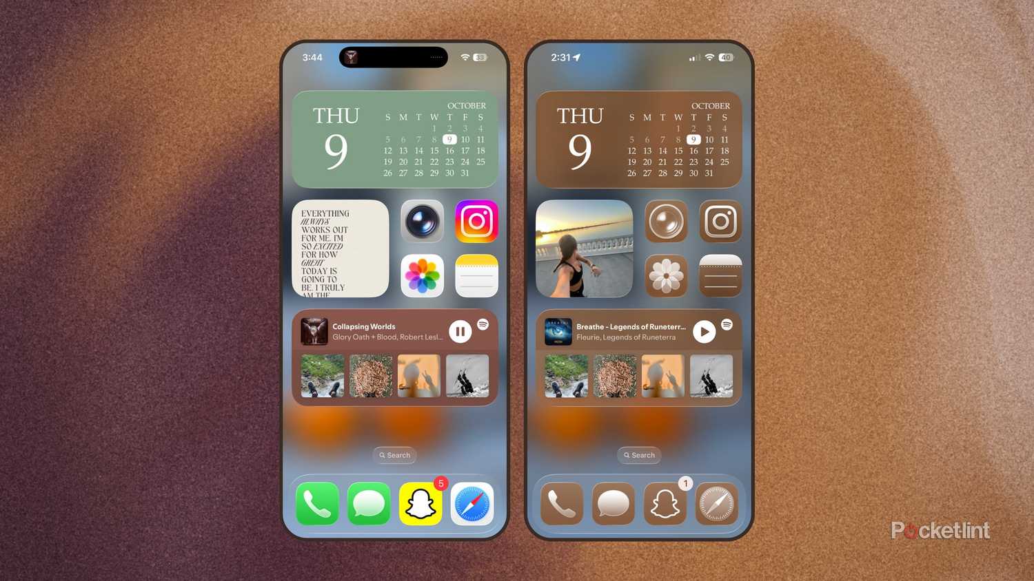
iOS 18 introduced the ability to mass-change your phone’s app appearance and create a cohesive, aesthetic home screen with colors of your choice. Most people I know opted for bright electric purples or serene sage greens — both screamed aesthetic — but bright colors are still attention-grabbing. If my Instagram app is suddenly turquoise, it’s still going to catch my eye (and the next 30 minutes of my time). Good start, Apple.
But iOS 26 made the appearance options even better with Liquid Glass, and finally tempted me enough to stray from the colorful defaults of my favorite apps. This is how I accidentally discovered my anti-addiction fix: I was playing with different colors and transparencies for my apps when I realized I was late for an appointment. In the panic that followed, I didn’t have time to pick the perfect color and literally ran out the door with my home screen tinted a muddy gray-brown.
After a few hours, the color had kind of grown on me (it matched the autumn vibes) but I noticed that my eyes weren’t getting snagged by the pinks, purples, and yellows of Instagram. I couldn’t even find TikTok’s famous music-note icon. X vanished somewhere in the chaos of my app hoard, and even Slack evaded my attention for a few hours… sorry, boss.
The epiphany came with a little frustration: I stopped scrolling and started relying on the search bar instead. But that action alone made every app tap an intentional move rather than a subconscious reflex.
To change your homescreen appearance, follow these steps:
- Click and hold blank space on your iPhone’s homescreen.
- When the apps start to jiggle, tap Edit in the upper left-hand corner.
- Select Customize from the dropdown.
- Select Tinted, and then drag the sliders to choose between colors and lightness.
I followed this up with another subtle tweak, and it ended up being the cherry on top.
Remove app names
A real guessing game if you don’t know all your apps
To make finding certain apps even harder, I erased all the labels from my home screen. To do so, follow the same steps as above and find the top-right toggle showing a small square next to a larger one. This lets you choose between smaller icons with names underneath, or bigger icons with no labels at all.
First of all, I just like the way the bigger icons look. But now, if I scroll to my third page of apps (many of which I download for articles and barely touch afterward), I can’t even tell what half of them are without opening them. It creates one more obstacle between my itch for a quick scroll and the app that could scratch it.
Other tweaks I found helpful
There’s another option on the opposite side of the icon-size toggle: light versus dark. I don’t mean the system-wide Light vs. Dark Mode — that comes later. This one changes the subtle background tone of your home screen. While the difference is minor, the darker version is easier on the eyes and dampens any visual noise behind your apps.
Then, I went to the bottom of the customization menu to choose Auto instead of Light or Dark. I liked the look of my tinted apps during the day, but the slight shift when the sun goes down gives my screen a whole new aura and makes my social feeds even less tempting. It’s easier on my eyes and keeps me from getting too comfortable with the layout.
These subtle variations are enough that I’ve noticed I’m spending less time doomscrolling and more time writing in my Notes app — my favorite (and far more productive) pastime.
Trending Products

Thermaltake V250 Motherboard Sync A...
CHONCHOW LED Keyboard and Mouse, 10...
SAMSUNG 27″ CF39 Series FHD 1...

HP Stream 14″ HD BrightView L...
HP Latest Pavilion 15.6″ HD T...
